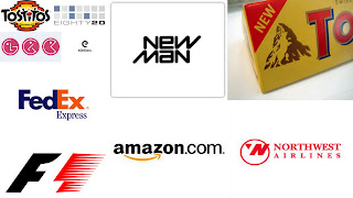
We had compiled a list of creative and thoughtful logos in our "!0 Creative Logos For Your Inspiration I" post; as a sequel to that we have chosen 10 company logos that carry hidden messages with them.
So have a look and learn how these companies have combined creativity with intelligence and wit. We hope that these logos not only help in fueling your creativity but also inspire you to think out of the box.
1. Toblerone
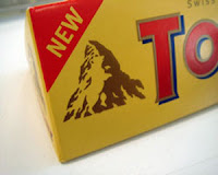
This is one of my favorite chocolates and I've been eating them for years, I was aware that the logo signifies Swiss Alps but never noticed a bear in the logo.Toblerone originated in a city called Bern in Switzerland, this city also known as "City of Bears".
2. Amazon

This logo is simple and pretty much demonstrates the essence of Amazon. The arrow moving from 'a' to 'z' denotes that the company sells about anything from a-z. But do notice the smile that the arrow makes, representing the smile that the company brings on a customer's face.
3. Formula 1

Incredible use of negative space that creates the shape of number one on the logo.
4. Tostitos
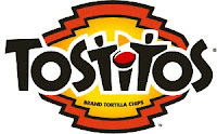
This logo is for a Tortilla Chips company, if you notice you can see two people enjoying the chips with a bowl of salsa. The logo is aimed to symbolize people connecting with each other by sharing a snack.
5. Body Wisdom
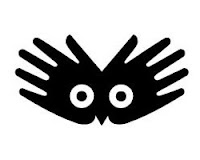
This logo is for a day spa company, the hands clearly convey relaxing massages.The 'owl eyes' in the center convey the message of 'wisdom', therefore Body Wisdom.
6. FedEx
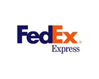
We all know that this company is known for their fast moving courier service. But did we know that they are conveying this message through a forward moving arrow in their logo? The letter 'E' and 'x' form an arrow denoting their speed in forward
direction.
7. Eight20
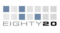
This is a consulting company for financial modeling and database work. Their logo is not that easy to decipher, specially for binary language virgins.
The dark squares are considered to be 1's and the lighter ones to be as 0's; this way the top line reads 1010000 and the bottom 0010100, which represents 80 and 20 in binary language.
8. L.G.

Although there is no solid evidence, but many people have come to believe that there is a Pac-Man hidden inside LG logo. :)
9. Newman
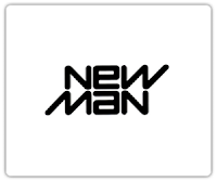
A very clever logo indeed, if you notice that this logo is reversible. A good example of simple yet witty logo.
10. NorthWest Airlines
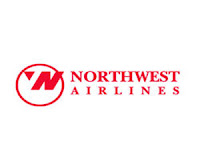
This is an old logo for Northwest Airlines, where they have very intelligently utilized the negative space for letter 'N' and 'W'.
Do notice the red triangle in the circle, symbolizing a compass pointing towards Northwestern direction.


ummm... the Tostitos people are probably enjoying the chips with a bowl of SALSA, not PASTA....
ooops...thanks M!