
 On our blog here, we have discussed everything about infographics but something that I guess we missed big time was analyzing them; things like who made the first infographic, what are its important parts, etc?
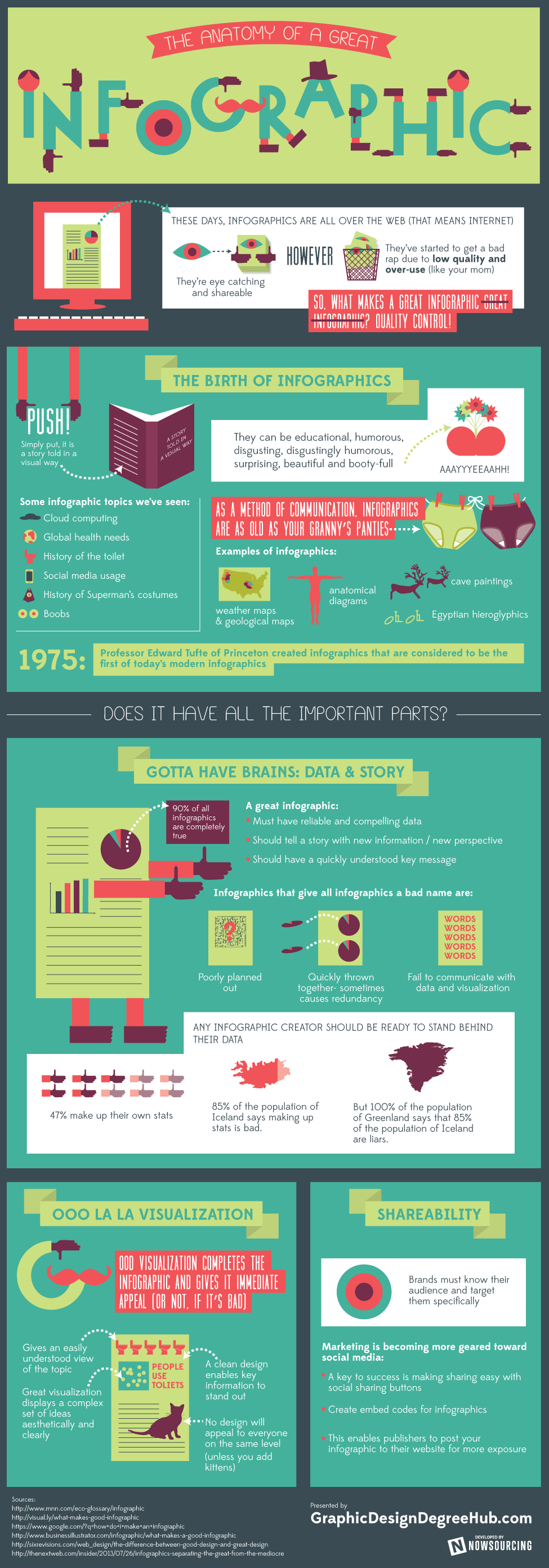
For those who don't know the first infographic was created in 1975 by a professor at the Princeton University, Professor Edward Tufte.
In a recent research done by the editors at Graphic Design Degree Hub on the topic - Anatomy of a Great Infographic, a lot of interesting facts were revealed like the birth of infographics,visualization, sharebility, what gives infographics a bad name, etc.
For us using infographics is just a way to convey useful information in the most easiest manner. Infographics have told us a great deal of stories; stories about cloud computing, social media usage, education and what not. But still they haven't been totally accepted by the online community, reason I guess people are still confused about using them.
If you ask me, no matter what people say or the researches reveal, using well-designed and high-quality infographics can really help you drive huge traffic to your website or blog, provided they are well shared and go viral.
According to the research done by the editors at Graphic Design Degree Hub, one must keep the following points in mind while designing an infographic:
- The infographic must have reliable and compelling data
- The information used to make the infographic should be new or it should tell the story with a new perspective
- The key message should be clear so that the viewer should easily understand it
- The infographic should be easy to read and comprehend in just few minutes
- The infographic should give a meaningful story
What do you think about this infographic? Do share your thoughts in the comment section below.
For regular updates from E-junkie follow us on Twitter.


Post a Comment